
Published :

Users are tired of wasting time by navigating to and from different sources. At the same time, they want the information to be organized so that it is not overloaded. To solve this, we have designed a Manager Analytics portlet with the help of Ramco’s PDK (Portal Developmental Kit) tool. Portlets are visual representations of data; usually role based i.e. if a manager signs in then it will show what is relevant for the manager. If I’m looking at a coworker’s portlet, it will give me the basic details. The Manager Analytics portlet has been designed to show the career development, behavioral appraisal, succession planning and various other useful data at a single glance.
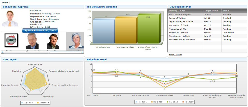
Portlets are feature-rich to provide the best user experience possible. Let me explain with behavioral appraisal; which shows the 360 degree view, comparison view of last 5 appraisals, top behavior exhibited by employees and training development plan.
 The 360 degree view, comparison view of last 5 appraisals, top behavior exhibited by employees and training development plan.
In designing this behavior appraisal portlet, we have used tab navigator, image list, charts, transparent grid, link, text and label. With the image list control, all the appraisers are listed with photos and a label. It will automatically enable a scrollbar when the images do not fit in the available space.
There are several types of charts available and we have used a bar chart, radar chart, and line chart. Bar chart is used to illustrate a set of data in a way that is easy to understand as well as simple to read. This chart has been used for top behaviors exhibited. Radar chart is a useful way to display multivariate observations with arbitrary number of variables. In this case the radar chart has been used to provide for a 360 degree appraisal. Line chart displays information as a series of data points connected by a line segment. The line chart has been used in this case for showing the behavior trend of the past 5 appraisals. This would visually excite the users and give them the required information at a glance.
Blog by: Balachandar C, Project Trainee, Ramco Systems